Answer
Follow along using the sample packaged workbook found in the Attachment section of this article.
1. Create a calculation field [Coordinate(x)] to locate the display position of the pie chart on the x- axis.
CASE [Segment]
WHEN 'Consumer' THEN 3
WHEN 'Corporate' THEN 2
WHEN 'Home Office' THEN 1.5
END
2. Create a calculation field [Coordinate(y) ] to locate the display position of the pie chart on the y- axis.
CASE [Segment]
WHEN 'Consumer' THEN 1.5
WHEN 'Corporate' THEN 2
WHEN 'Home Office' THEN 1.2
END
3. Add the [Coordinate(x)] to the Columns shelf and right-click on it change the the [Measure] to [Average] as shown below.
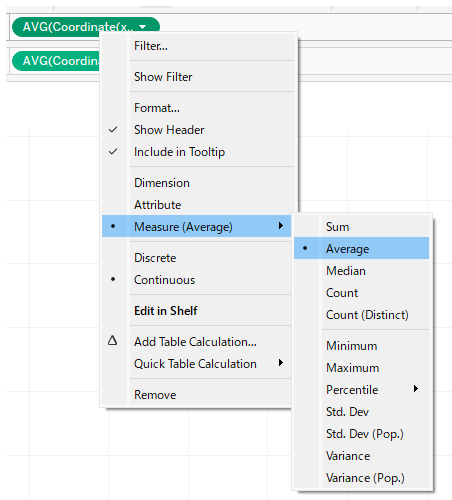
4. Add the [Coordinate(y)] to the Rows shelf and right-click on it to change the the [Measure] to [Average] as shown above.
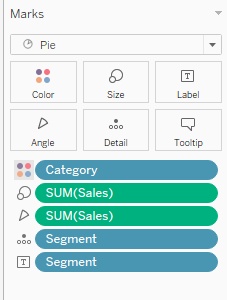
5. On the Marks card do the following:
・Select [Pie] chart type from the pull-down list.
・Add [Sales] to [Size] and [Angle]
・Add [Category] to [Color]
・Add [Segment] to [Details] and [Text]
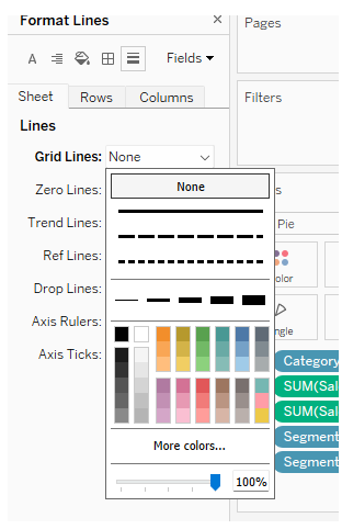
6. Remove the grid line by clicking on the menu [Format]> [Line]
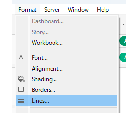
and click on [Grid lines] >[None] on the [Sheet] tab on the format menu.
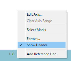
7. Right-click on the x-axis and y-axis to uncheck [Show Header], to hide the axis.